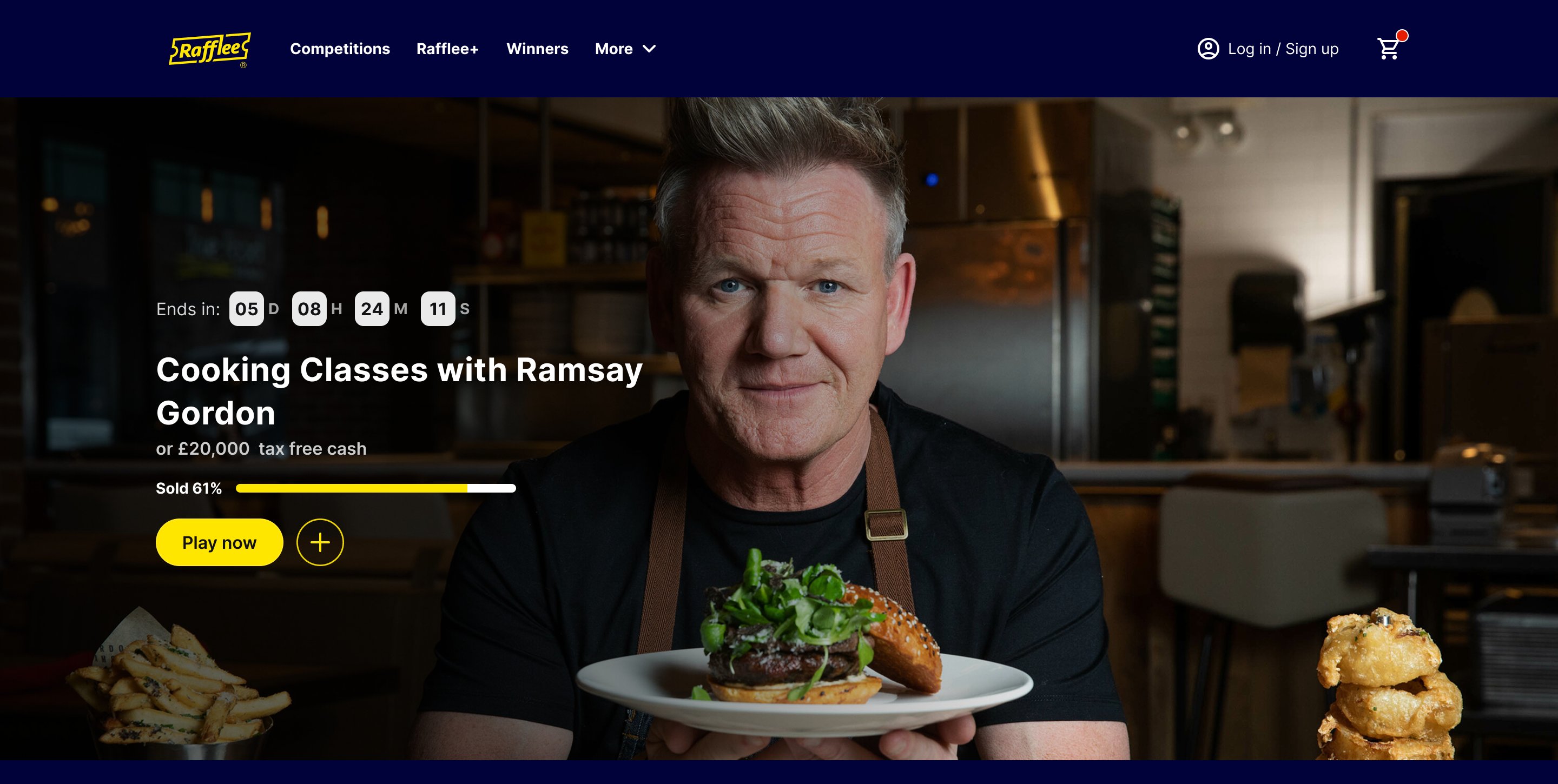
A UK prize-draw platform built around trust, simplicity, and responsible participation. Rafflee is a real-money prize-draw and competitions platform built for the UK market — designed and shipped from scratch, covering everything from discovering a competition and entering a draw to managing tickets, subscriptions, payments, and winnings.
RoleProduct Designer
Scope0 → 1 · Product Design · UX/UI
PlatformsWeb · Mobile Web · App
LaunchedNovember 2025
The challenge
Building a new product meant solving more than the interface. Rafflee lets people enter prize draws for cars, watches, holidays, and cash through multiple competition formats, ticket options, subscriptions, and payment flows.
Because it was a ground-up build, the experience had to work as one cohesive product across desktop web, mobile web, and native app — while reusing existing backend services wherever possible to move quickly. The challenge was to make all of that complexity feel simple, clear, and trustworthy to the person using it.
A prize-draw product asks users to spend money on an outcome they cannot immediately see
Trust had to be part of the product — not an afterthought
A prize-draw product asks users to spend money on an outcome they cannot immediately see. That makes transparency especially important. UK prize competitions also require a genuinely free, equal-chance route alongside the paid entry route. Instead of treating these requirements as legal information to be added later, they became part of the core experience.
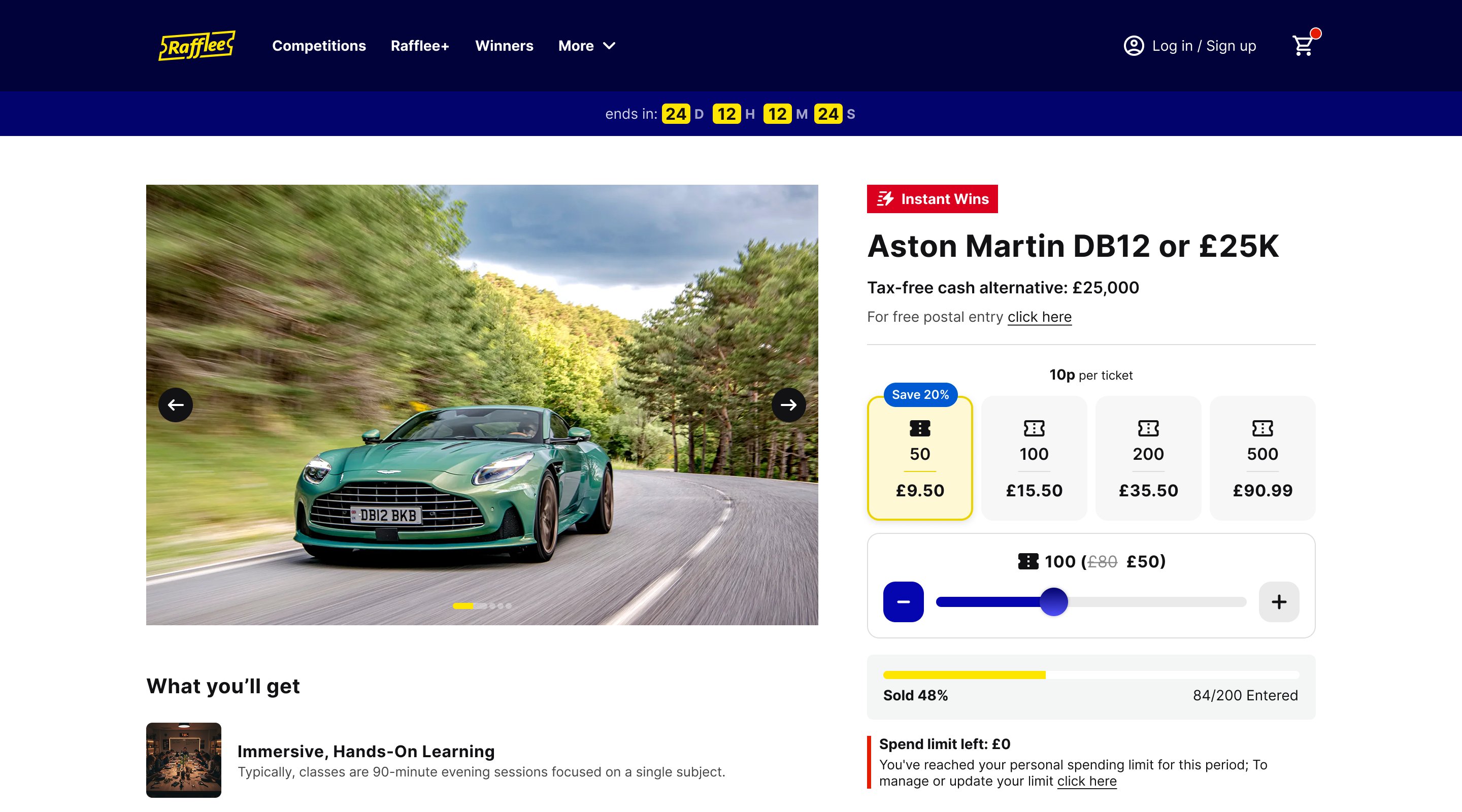
01 — Make free entry visible. Free postal entry is surfaced directly on the listing, competition page, and entry flow rather than being buried in the terms and conditions.
02 — Make the value transparent. A tax-free cash alternative is shown alongside the prize, helping users understand the value of what they could win.
03 — Make the promise explicit. The guaranteed giveaway promise is communicated upfront as a trust signal rather than hidden inside an FAQ.
Important information is available at the moment users are deciding whether to enter.
How might we make a complex prize-draw ecosystem feel simple and trustworthy?
The experience had to balance several competing needs at once.
For the business
Support multiple competition formats, subscriptions, payments, and a new product model.
For users
Make competitions easy to discover, understand, and enter.
For trust
Keep free entry, prize value, spending controls, and other important information visible.
Across platforms
Create a consistent experience across desktop, mobile web, and app.
The design direction was simple: hide complexity where users don't need it, and surface it where it helps them make a decision.
Making a catalogue of competitions easy to navigate
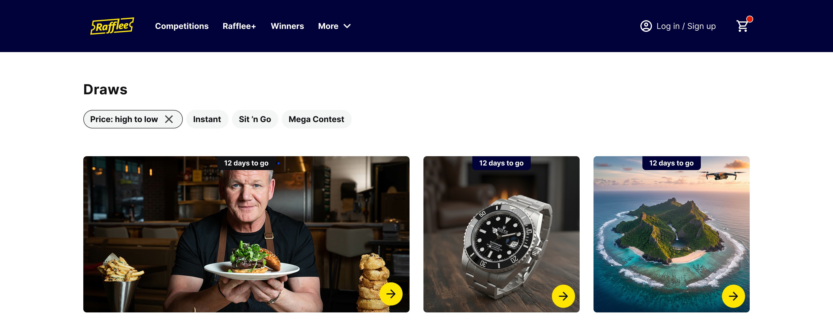
Rafflee supports several competition formats — Mega competitions, Instant Wins, Sit 'n Go, and standalone raffles. Instead of putting everything into one undifferentiated catalogue, the experience separates these formats so users can understand what they're looking at before deciding to enter.
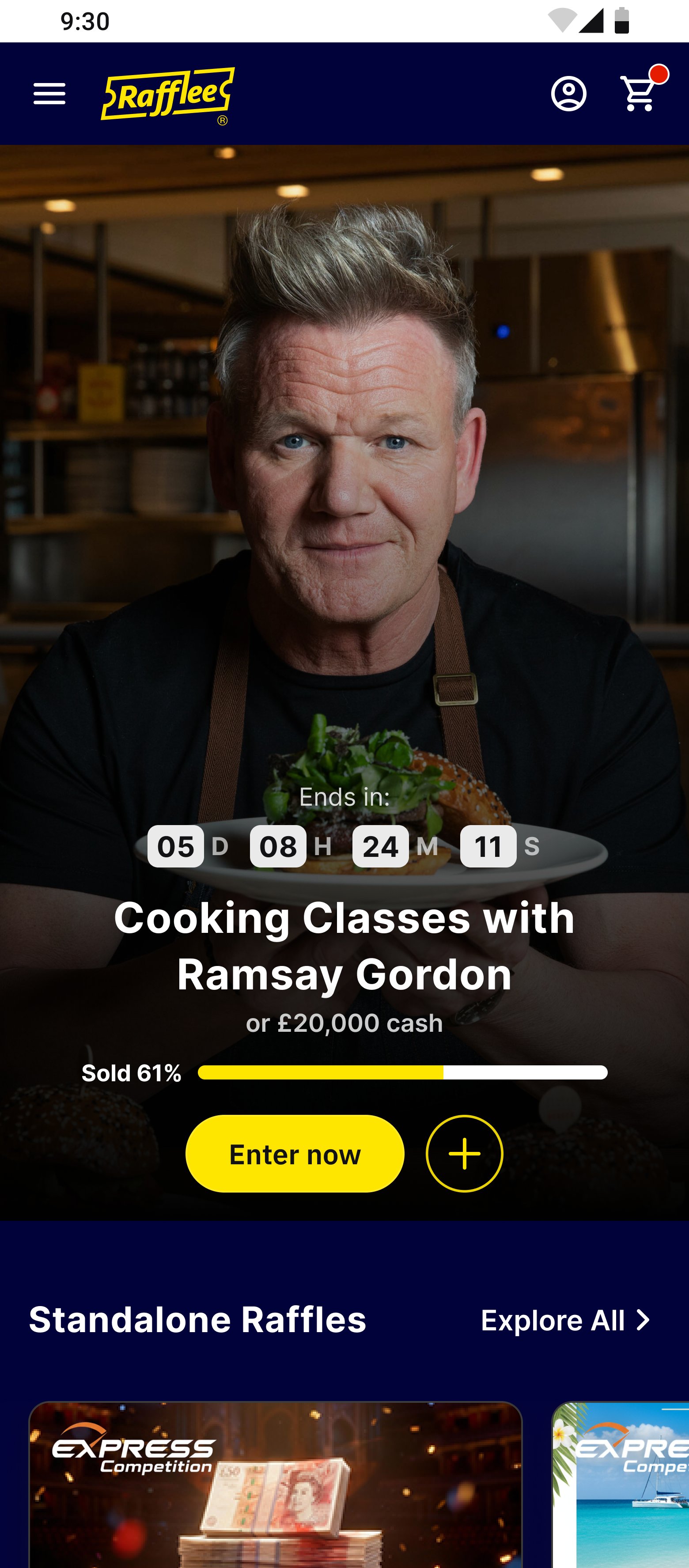
Filter by price, format, and contest typeSame structure carried across desktop and mobile web
Different competition formats shouldn't feel like different labels on the same experience — their structure and presentation should help users understand the difference before they commit.
Making subscription value obvious at a glance
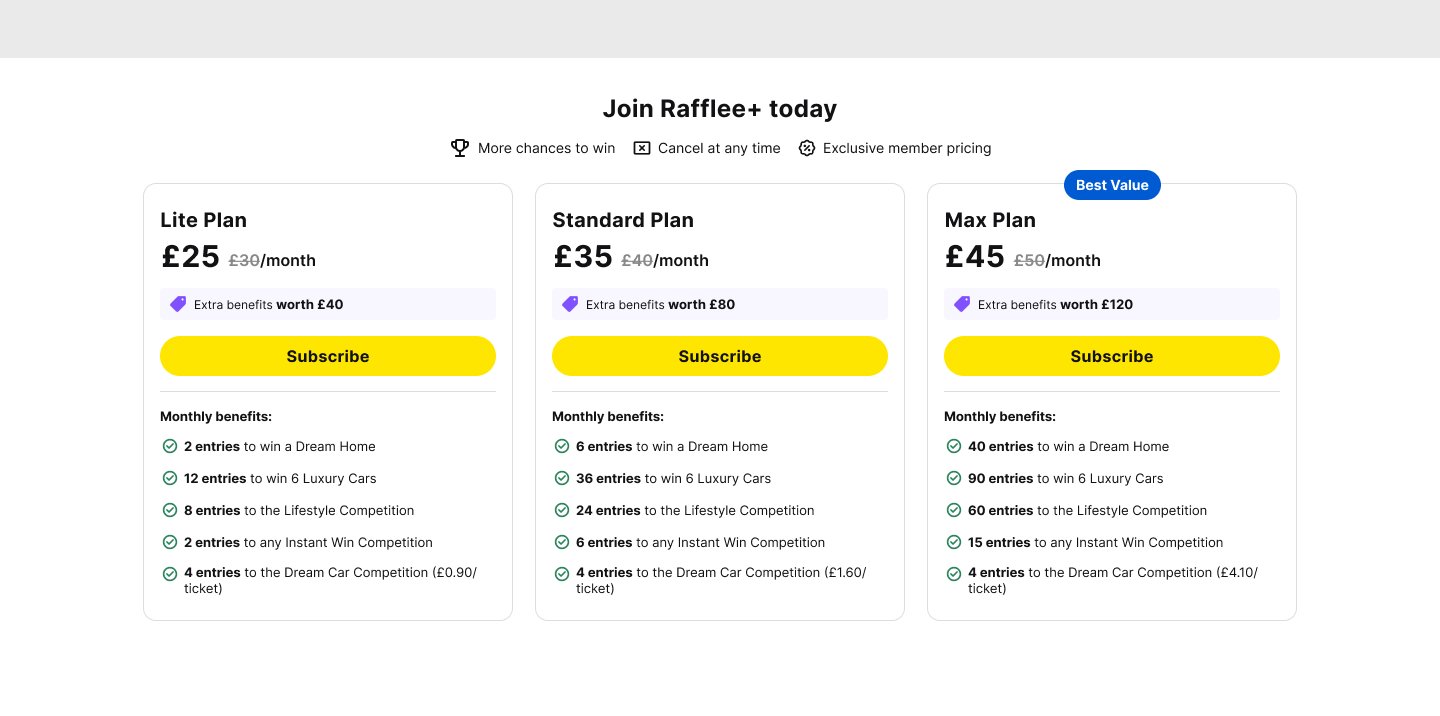
Rafflee+ introduces recurring entries across Mega, Instant Win, and Lifestyle competitions. The challenge wasn't simply presenting three subscription plans — users needed to understand what they were getting and whether upgrading offered better value, without having to calculate it themselves.
Keep the choice simple. Three tiers — Lite, Standard, and Max — avoid overwhelming users with too many options.
Show the value where the decision happens. The per-ticket value improvement is shown directly alongside the entry count.
Address hesitation upfront. "Cancel at any time" appears next to pricing rather than being hidden elsewhere.
The shortest path was the better experience
Removing the cart from a single-decision purchase
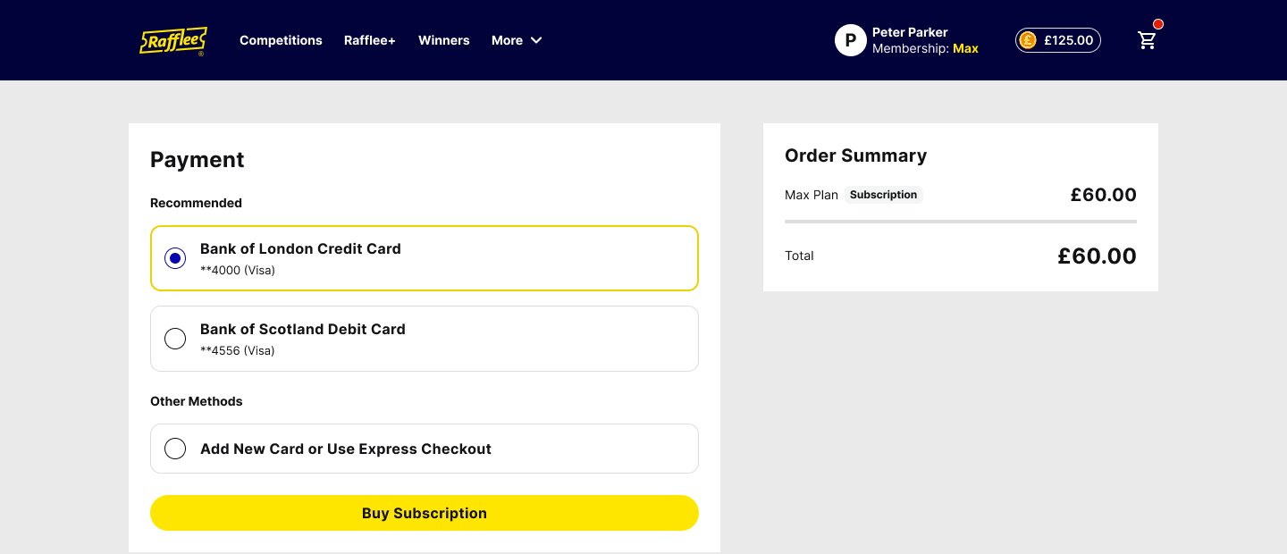
Most Rafflee purchases are immediate decisions: enter a draw or subscribe. A traditional cart would introduce another step without adding much value, so the experience skips it — "Enter now" and "Subscribe" both go straight to payment, with saved cards and express checkout further reducing friction for returning users.
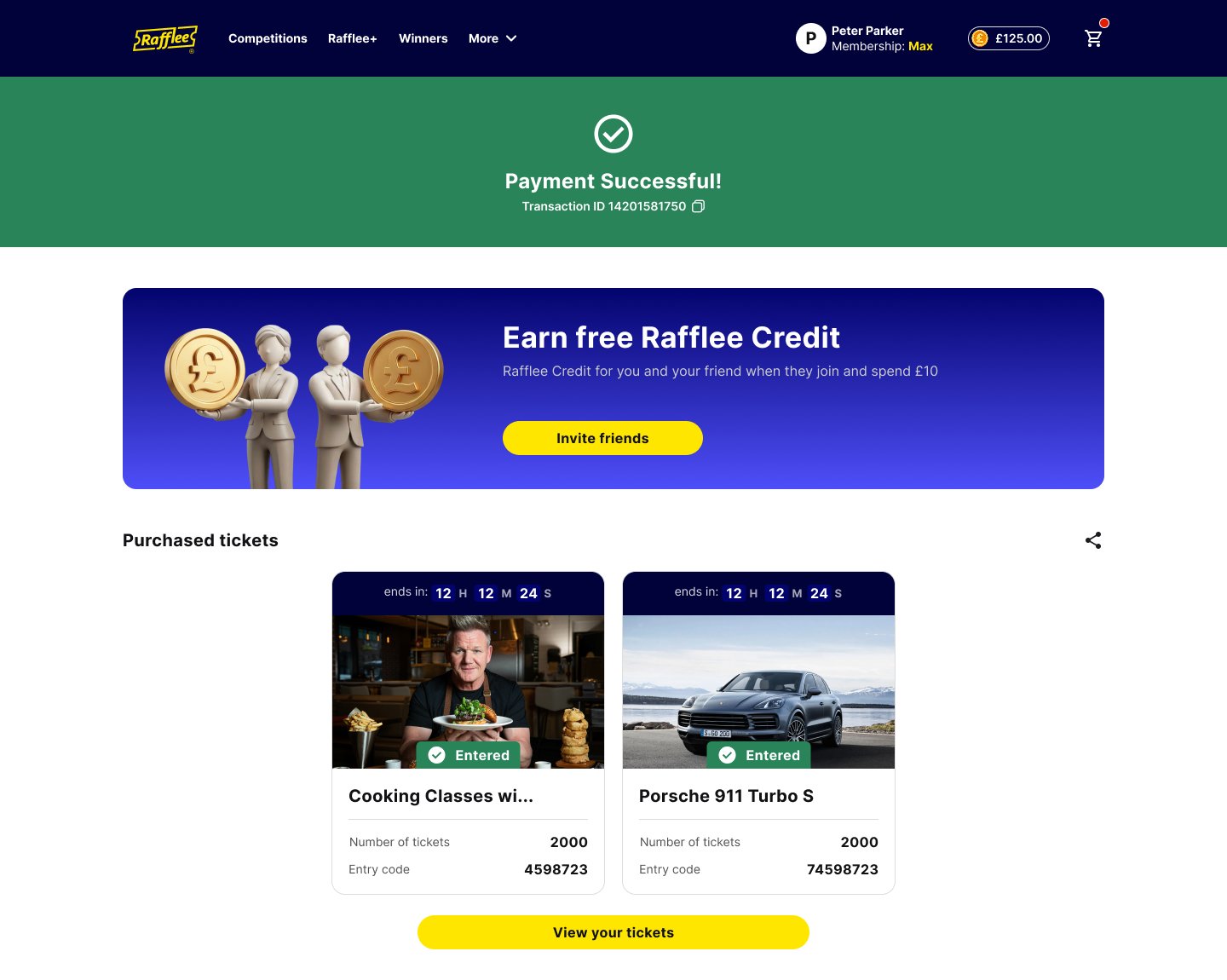
Saved cards plus express checkout — no cart step in betweenConfirmation immediately surfaces tickets and a referral opportunity
A familiar e-commerce pattern wasn't necessary here — the shortest path was the better experience. And the transaction itself didn't need to be the end of it: rather than treating payment success as a dead end, the confirmation screen became a chance to help users take the next useful action.
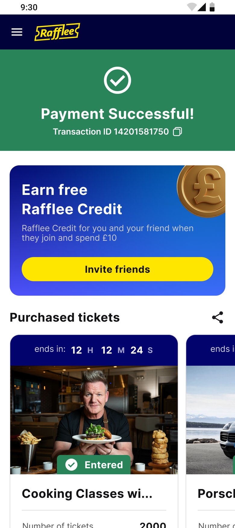
The same confirmation pattern carries through to mobile web, with purchased tickets visible immediately after payment.
Giving users control after the purchase
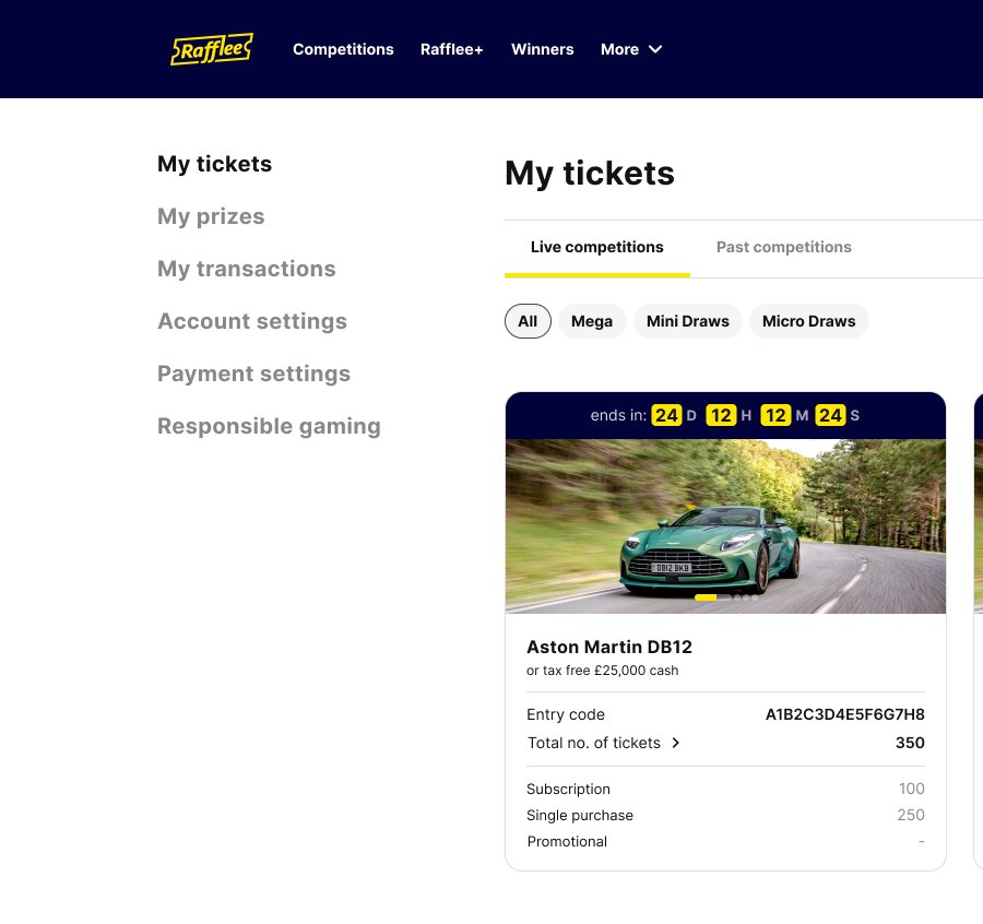
The account experience brings tickets, prizes, transactions, and settings together in one place. Responsible gaming was treated as a first-class part of the experience rather than something hidden in a footer or secondary menu.
My Tickets, Prizes, Transactions, Payment Settings, and Responsible Gaming — all with equal weight in account navigation. User control shouldn't disappear after the purchase.
Five decisions that shaped Rafflee
Guest-first checkout
No forced sign-up before entering a draw. Account creation shouldn't become a barrier before a user has decided what they want to purchase — so purchase comes first, with account creation introduced only where it's actually needed.
Treat competition formats differently
Mega, Instant Win, Sit 'n Go, and standalone raffles are visually and structurally separated. Different formats carry different expectations — combining them into one long list would make discovery harder.
Put trust information where decisions happen
Free entry, cash alternatives, and the guaranteed giveaway promise appear directly within the product experience — not left for users to search through FAQs or terms and conditions.
Make subscription value visible
Each Rafflee+ plan shows its per-ticket value improvement alongside the entry count, so users shouldn't have to calculate whether a subscription represents better value.
Make responsible gaming part of the product
Spend limits are visible directly on the competition experience, while Responsible Gaming has a dedicated place in account navigation — responsible participation as part of the core experience, not an afterthought.
From an empty canvas to a live product
Rafflee launched in November 2025 as a complete 0 → 1 product spanning competition discovery, draw entry, ticket bundling, subscriptions, payments, and account management — across web, mobile web, and app.
Since launch, the platform has supported live competitions across cars, watches, holidays, and cash prizes, with winners surfaced through its winners feed and a recurring subscriber offering through Rafflee+. The result was a complete product ecosystem — not just a collection of screens.
Simplicity isn't about removing complexity — it's about deciding which complexity the user actually needs to see
Reflection
The product had to support multiple competition formats, purchase models, subscriptions, payments, account functions, and responsible gaming requirements, without making the experience feel complicated. The most important design work wasn't any single screen — it was creating a consistent system that made those different experiences feel like one product.
Looking back: if I continued working on Rafflee, I'd focus on understanding how people move through the product after their first purchase — particularly discovery, subscription behaviour, and repeat participation — and use that insight to guide the next round of product improvements.