Making a high-density gaming interface easier to scan, understand, and act on. The poker table is where every decision happens — I redesigned Junglee Poker's game table to reduce visual clutter, strengthen information hierarchy, and make critical actions easier to understand, especially for players managing multiple tables.
ProductJunglee Poker
RoleSenior Product Designer
FocusInteraction & visual design
The challenge
The table had to show a lot — without making players think about the interface. Players need to understand their cards, the pot, bets, chip stacks, player states, and available actions, often within seconds.
The existing table was functional, but information competed for attention. Player details were difficult to scan, actions lacked a consistent visual hierarchy, and important gameplay elements could get lost in the interface — particularly noticeable for multi-tabling players, who need to process several tables quickly.
The goal: create a table that feels clear, fast, and immersive without removing the information experienced players rely on.
Five things players need to understand at a glance
Through surveys, in-game feedback, and stakeholder input, we identified the elements that demanded the most attention during gameplay.
01 — Cards. The most important information for decision-making. Players need immediate clarity on their own hand and the shared cards.
02 — Pot value. The total pot helps players understand the risk and reward of each hand.
03 — Bets. Players need to quickly read their own and opponents' bet amounts to understand the flow of action.
04 — Table balance. Chip stacks need to remain visible so players can assess the state of the table, particularly during multi-table play.
05 — Player identity. Names need to be easy to recognise so players can quickly identify opponents during fast-paced games.
The design challenge wasn't to show less information. It was to make the right information easier to find
We looked at how leading poker products solved the same problem
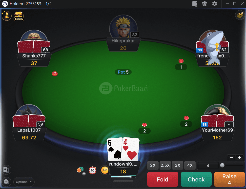
We benchmarked Junglee Poker against Natural8 and PokerBaazi across visual design, information hierarchy, layout and ergonomics, interactivity, feature availability, and performance. The comparison highlighted a clear opportunity: competitors presented gameplay information with stronger hierarchy and richer feedback, while Junglee's table felt more visually crowded and player information was harder to parse.
PokerBaaziNatural8
Clearer hierarchy. Important information should immediately stand out.
Stronger grouping. Related information should feel like one unit.
Better feedback. Player states and game events should be visible without adding noise.
How might we reduce visual noise without reducing the information players need?
From the research and competitive analysis, I focused the redesign around five goals.
Simplify
Reduce unnecessary visual elements and competing information.
Prioritise
Make cards, pot, bets, player state, and actions immediately scannable.
Clarify
Create stronger relationships between related information.
Improve interaction
Make Fold, Call, and Raise easier and faster to use.
Elevate the experience
Create a modern, premium visual language that feels appropriate for a real-money gaming product.
We explored how much information the table really needed to show
The redesign wasn't about simply making everything bigger or removing information — the focus was on grouping, hierarchy, positioning, and interaction.
Before
Player information
Player name, chips, avatar, and other information competed for attention.
Direction → Decision
Player information
Group the information into a single, predictable player unit — showing only what players need during the hand, while keeping secondary information available elsewhere.
Before
Betting actions
Fold, Call, and Raise lacked consistent sizing, contrast, and positioning.
Direction → Decision
Betting actions
Create a clear action hierarchy with larger, consistent controls positioned for easy reach — making the primary actions visually distinct and predictable.
Before
Cards
Hole cards could get lost within the surrounding interface and lacked sufficient visual prominence.
Direction → Decision
Cards
Give cards a stronger visual position and clearer treatment, making them immediately recognisable as the most important gameplay element.
Every visual change had a reason behind it
Group information players read together
Player name, chip stack, and avatar were grouped into a single visual unit — related information should be processed as one piece rather than several independent elements.
Principle: Gestalt grouping
Put critical actions within easy reach
Fold, Call, and Raise were enlarged and positioned at the bottom of the interface — the most frequent actions should require minimal effort to locate and activate.
Principle: Fitts's Law
Reduce decision friction
Betting was simplified into preset sizes alongside a clear slider — too many choices can slow decision-making, so players should be able to select a bet quickly.
Principle: Hick's Law
Make player states impossible to miss
All-in, Check, Disconnected, and other states received clearer visual treatment — players need to understand what is happening at the table without searching for status information.
Create a stronger visual hierarchy
Cards, pot, bets, player states, and actions received distinct levels of visual emphasis — not everything on a poker table has equal importance at every moment.
Before & after
Before
Redundant labels, cluttered chip placement, cropped avatars, and inconsistent spacing made player information difficult to scan.
After
A streamlined player layout focuses on the essentials: name, stack, and action.
Design outcome: players can identify table information more quickly without unnecessary visual noise.
Before
Action buttons had inconsistent colours, low contrast, irregular sizing, and blended into the table.
After
Fold, Call, and Raise use consistent sizing, stronger contrast, and a predictable position for easier access.
Design outcome: the primary actions become easier to locate and distinguish during gameplay.
Before
Hole cards competed with surrounding information and lacked sufficient visual prominence.
After
Cards receive a stronger central treatment with clearer numerals and improved stacking visuals.
Design outcome: players can identify their hand more quickly and maintain focus on gameplay.
Before
Turn timers could cover player information, while status indicators were difficult to track.
After
Clear status tags, active-player highlighting, and winning-hand labels provide stronger feedback during gameplay.
Design outcome: players get a clearer picture of what is happening at the table without having to search for it.
Cards → Pot → Bets → Player state → Actions
A table designed around how players actually scan the game
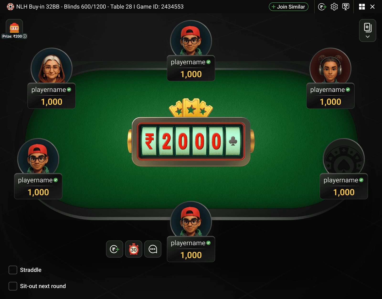
The redesigned table creates a clearer hierarchy between information, state, and action. Instead of treating every element as equally important, the interface guides attention toward the information players need at each moment.
The result is a cleaner and more focused table that lets players spend less attention understanding the interface and more attention on the game itself.
Less visual noise. Unnecessary labels, inconsistent spacing, and competing elements were reduced.
Stronger hierarchy. Critical gameplay information is easier to identify and scan.
Clearer actions. Fold, Call, and Raise have a consistent and predictable interaction pattern.
Better feedback. Player states and game events are more visible.
More cohesive visual language. The table moves toward a modern, premium gaming aesthetic.
Designed to disappear behind the game
The final table brings together the new information hierarchy, interaction patterns, player states, and visual system across different gameplay situations.
The goal wasn't to make the table look simpler. It was to make playing feel simpler.
Clarity comes from hierarchy, not reduction
Reflection
A poker table will always be information-dense. Trying to remove everything would only make the experience less useful for experienced players. The better approach was to understand what deserves attention, when it deserves attention, and how quickly players need to find it. That became the foundation for the redesign.