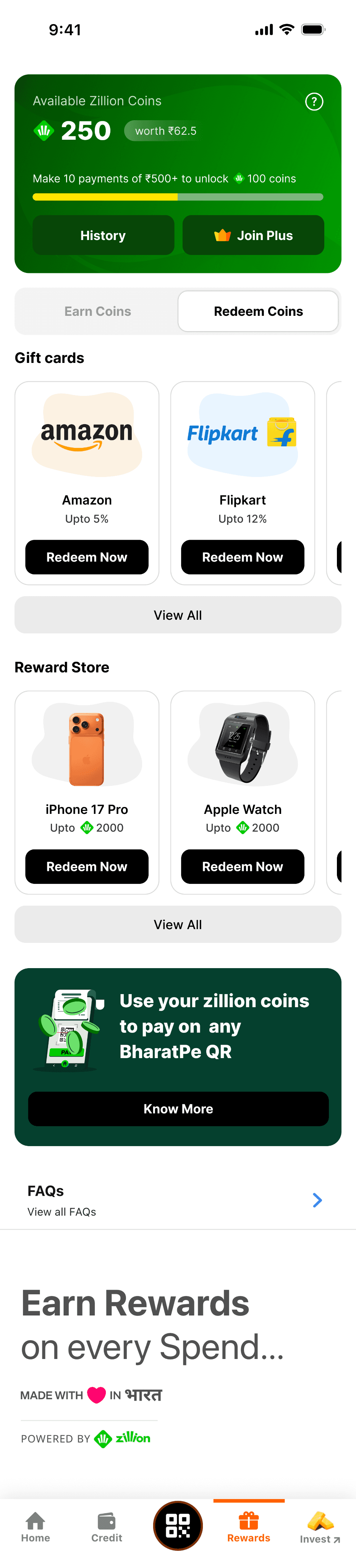
Turning an overlooked rewards feature into an experience users could discover, understand, and use. Zillion Coins had the potential to make everyday payments more rewarding, but the experience made the feature difficult to discover and even harder to understand. I redesigned the BharatPe homepage, onboarding, and rewards experience to make the earn-and-redeem journey clearer and more accessible.
RoleProduct Designer
FocusHomepage · Onboarding · Rewards experience
GoalDiscoverability · Education · Engagement
A valuable reward was hiding in plain sight
Zillion Coins were intended to become a meaningful part of the BharatPe ecosystem, but the experience wasn't making that value obvious. Users had to find the feature themselves, understand what the coins meant, figure out how to earn them, and then understand where they could redeem them — fragmented across different touchpoints, making the overall journey harder to follow.
The challenge: how might we make Zillion Coins visible and understandable enough that users naturally engage with the rewards journey? The redesign needed to solve three things:
Discover
Help users notice Zillion Coins in the primary BharatPe experience.
Understand
Explain what Zillion Coins are, how they are earned, and what they are worth.
Use
Create a clear path from earning to redeeming rewards.
The redesign needed to make rewards part of the everyday payment journey
These were the business goals documented for the redesign.
01 — Increase visibility
Make Zillion Coins easier to discover within the primary user journey.
02 — Close the knowledge gap
Explain Zillion Coins clearly and distinguish them from traditional cashback.
03 — Create a reward-driven habit
Use rewards to make routine payments feel more engaging.
04 — Encourage valuable actions
Use Zillion Coins as a lever to motivate higher transaction activity.
05 — Strengthen redemption
Make the earn-to-redeem journey clear enough that users actually experience the value of the rewards.
Five friction points were breaking the rewards journey
01 — Zillion Coins were hard to discover. The feature wasn't prominent enough on the homepage, making it easy to miss.
02 — The value wasn't immediately clear. Users didn't have an obvious answer to two basic questions: how do I earn Zillion Coins, and what can I do with them?
03 — Navigation didn't match expectations. The Zillion icon could lead users to unexpected sections instead of a dedicated rewards experience.
04 — Redemption broke the journey. Redirecting users to external apps disrupted the transition from earning to spending.
05 — The experience felt fragmented. Inconsistent UI patterns across touchpoints made the rewards program feel less cohesive and credible.
The core opportunity was to turn Zillion Coins from a feature users had to find into something they could immediately understand
The experience needed to behave more like a wallet than a hidden feature
Users expected:
Visibility. A prominent Zillion balance on the homepage.
Clarity. A simple explanation of the coin's value — including the relationship between coins and rupee value.
Predictability. Tapping Rewards should lead to a dedicated rewards experience.
Continuity. Users should be able to redeem without being pushed into unfamiliar external experiences.
Progress. Users should understand how close they are to earning their next reward or bonus.
We studied how other consumer apps made rewards visible
We reviewed reward and rebate patterns from INDMoney, Navi, Google Pay, and CRED to understand how Indian consumer products surface incentive systems within their home experiences. Rather than copying individual patterns, the goal was to identify recurring behaviours.
INDMoneyNavi
Put the reward balance somewhere users naturally look.
Explain the value early.
Make progress visible.
Give rewards a dedicated destination.
Keep the path from earning to redemption clear.
Before jumping into UI, we mapped the journey
Low-fidelity flows explored three key states: how a first-time user understands Zillion Coins, how a returning user quickly accesses their rewards, and how users move between earning, tracking, and redeeming in the rewards hub.
First-time user landingRewards / Zillion Coins landing
This helped separate the experience into two complementary layers: the homepage (Discover → Understand → Enter) and the rewards hub (Track → Earn → Redeem).
Making Zillion Coins visible from the start
The homepage became the first opportunity to introduce the rewards ecosystem.
Higher visibility. Zillion Coins received a more prominent placement within the primary experience.
Clearer value. The onboarding journey explains what Zillion Coins are and how they work.
Guided entry. Zillion touchpoints lead into a consistent onboarding experience rather than isolated screens.
Persistent help. Users who skip onboarding can access the Zillion guide later through the Help icon.
Homepage with Zillion balance surfacedGuided onboarding explaining the earn-and-redeem lifecycle
The goal wasn't to force users through onboarding. It was to make understanding available whenever they needed it.
Turning rewards into a destination, not a dead end
Once users entered the rewards experience, the next challenge was helping them understand what they could do with their coins.
Balance first. The Zillion Coin balance is immediately visible at the top.
Progress. A rewards nudge encourages users to complete transactions and work toward bonus coins.
Zillion Plus. The subscription/value proposition receives a more prominent position.
Earn and Redeem. The two core actions are separated into tabs, reducing unnecessary scrolling.
Consistent experience. Earn and Redeem use the same visual language to create a more cohesive rewards ecosystem.
Five decisions shaped the new rewards experience
Put the balance where users expect it
Make the Zillion balance prominent within the primary experience. A reward that users can't see can't become part of their mental model.
Explain before asking users to engage
Introduce a guided onboarding journey explaining the earn-and-redeem lifecycle — users shouldn't need to explore multiple screens to understand what Zillion Coins are.
Give rewards a dedicated destination
Route Zillion touchpoints into a dedicated rewards experience — the journey needs a predictable home rather than scattered entry points.
Separate Earn and Redeem
Organize the rewards experience into two clear tabs — users arrive with different intentions, and separating these actions reduces unnecessary navigation.
Keep the explanation available
Make the Zillion guide accessible through Help even after onboarding is skipped — education shouldn't be a one-time opportunity.
A clearer path from payment to reward
The redesign connected the previously fragmented Zillion experience into a more coherent journey.
Discover → Understand → Track → Earn → Redeem
The redesign turned Zillion Coins from something users had to discover into something the product could actively explain and guide them through.
Visibility isn't the same as discoverability
Reflection
Simply placing a rewards feature on the homepage doesn't guarantee that users will understand it. For Zillion Coins, the bigger challenge was creating a connected mental model: what is it? How do I earn it? How much is it worth? Where can I use it?
The redesign focused on answering those questions progressively instead of presenting the entire rewards system at once.
If I were continuing the work: I'd next look at behavioural data across the journey — from first exposure to onboarding completion, earning, and redemption — to understand where users continue to drop off and where the rewards experience creates the most value.