A real-money gaming redesign for Junglee Games
Redesigning the Poker Game Table
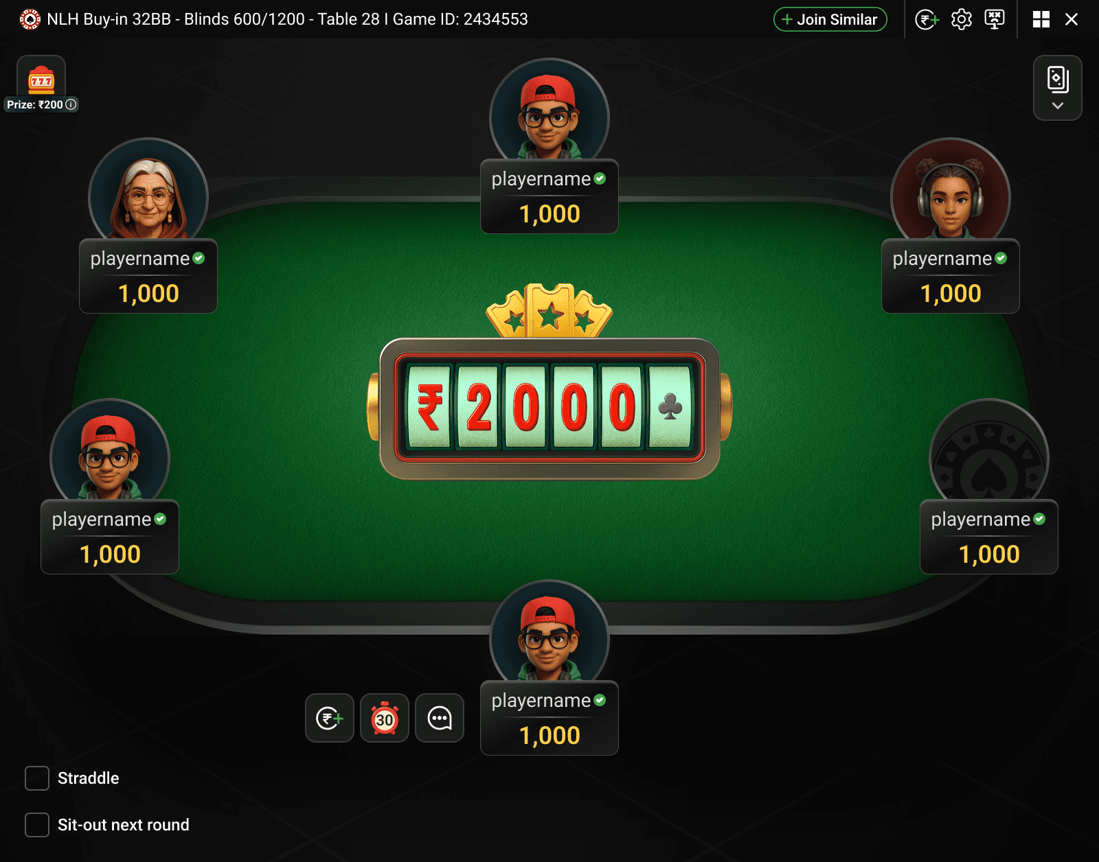
A cleaner, more intuitive redesign of the poker game table that reduces clutter and cognitive load, delivering a more immersive player experience.

A cleaner, more intuitive redesign of the poker game table that reduces clutter and cognitive load, delivering a more immersive player experience.
The game table is the core experience of any online card game — it's where players spend most of their time, so it has to be intuitive, visually clear, and engaging.
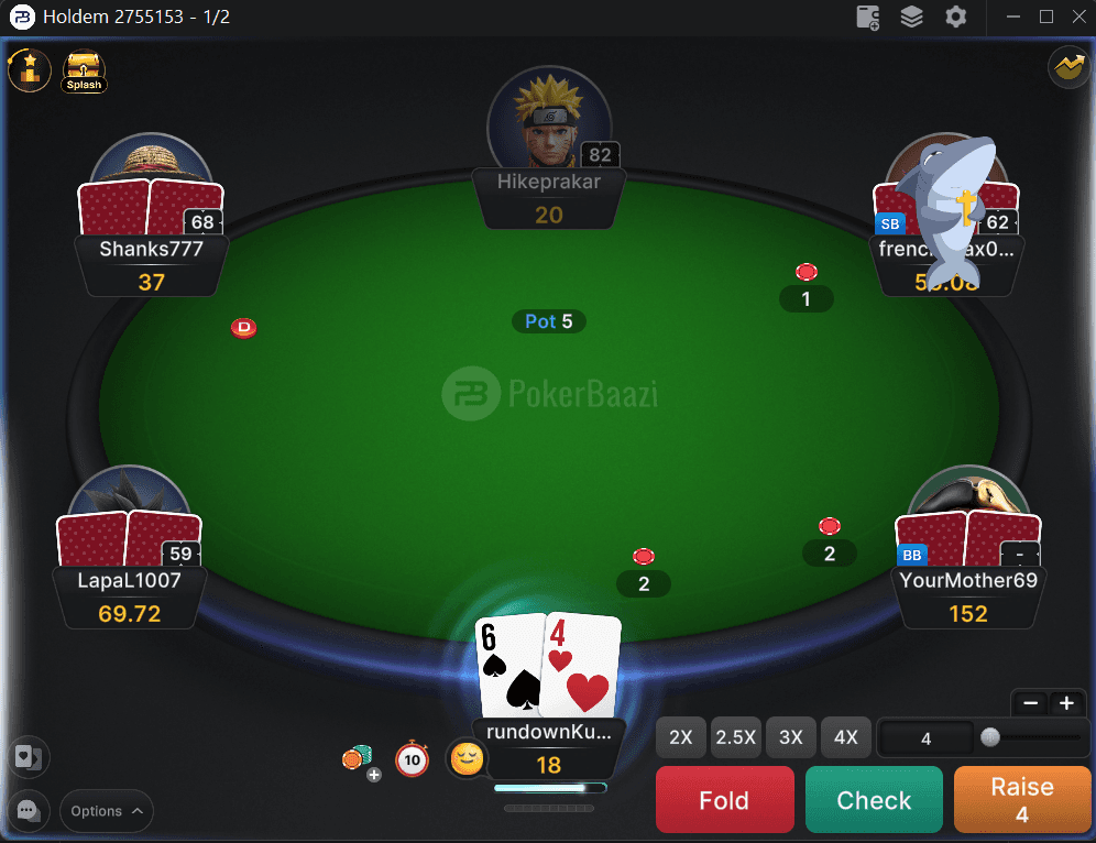
The old design was functional but cluttered, inconsistent, and behind modern usability standards. The redesign aimed to create a cleaner, more immersive, and user-friendly table that improves engagement and reduces cognitive load.
Through surveys, in-game feedback, and stakeholder input, multi-tabling professionals in particular reported poor readability of core gameplay elements. Five priorities emerged for where players' attention actually goes:
Junglee Poker was benchmarked against Natural8 and PokerBaazi across visual design, layout and ergonomics, interactivity, feature availability, and performance. The pattern was consistent: competitors led on visual distinctiveness, clear information hierarchy, and rich feedback, while Junglee's table felt cluttered and its player information hard to parse.

People naturally perceive visual elements as organised groups rather than individual pieces.
Grouped player name, chips, and avatar into a single clear unit, cutting clutter and improving scannability.
Time to reach a target depends on its size and distance — bigger, closer targets are faster to hit.
Fold, Call, and Raise were enlarged and moved to the bottom for quick reach, especially on mobile.
More choices mean slower decisions — fewer, clearer options speed things up.
Simplified betting to preset sizes plus a clear slider, cutting overwhelm and speeding gameplay.
Redundant labels, cluttered chip placement, cropped avatars, and uneven line spacing left players questioning the table's polish.
A streamlined player layout shows only essentials — name, stack, action.
Impact: players scan the table instantly, with no cognitive overload.
Action buttons had inconsistent colors, low contrast, irregular sizing, and blended into the background.
Larger, high-contrast buttons in standardized colors — red for Fold, green for Call, orange for Raise — placed for easy thumb reach.
Impact: faster decisions, fewer misclicks.
Hole cards got lost in the clutter, were placed unrealistically on the table, and were too small to read clearly.
Centralised cards with clear numerals and improved stacking visuals for a realistic, premium feel.
Impact: easier to track cards and bets, more confidence in gameplay.
Turn timers covered player info, status was hard to track, and floating emoji icons felt disconnected from the profile.
High-visibility status tags (All-in, Check, Disconnected), a glowing active-player highlight, and descriptive winning-hand labels.
Impact: stronger situational awareness, less confusion, more immersion.

Players spend more time on tables thanks to better usability.
A cleaner layout makes it easier for new players to adapt.
An elevated design aligns with modern gaming standards, increasing trust and appeal.
The redesign transformed the game table into a modern, intuitive, immersive experience. The new interface looks premium while improving usability and reducing cognitive load — letting players focus on strategy rather than fighting the interface.